Saturday, July 20, 2013

Cutie Pie is # 16

     I'm on a roll tonight so I followed the template very closely.  I changed out a doily for the three flower stamps.  I used one kit for the whole layout.

 
Paper Strips template by The Ardent Sparrow (Pixels & Co)
Familiarity by Karla Dudley (P&C)
Font: The Dawn
  

Layout # 15

     I finally made a layout that features Greg.  It, of course, includes Vivian.  The template that I used features lots of layering which is something I'm not particularly good at.  The kit had lots of elements to use for the layering, but not a good set of leaves.  I had to get the leaves from another kit.  I kept everything from the same designer.

 
Layer It Vol. 3 template by Mye De Leon (Pixels & Co)
Currently & Let It Be Me by Mye De Leon
Fonts: Precious, Bebas, Century Gothic

Friday, July 19, 2013

P&C Layout #14

     I felt bad that I had to abandon that layout with Ewan.  I found some elements to a kit I got for $1 from the old Design House Digital site.  The designer got married and now designs under her married name; I had her maiden name listed in my database and didn't realize that Shannon McNab used to be Shannon Haggerty.  While I can still get freebies, I nabbed the elements to round out the kit.  Even though the photos were taken in the spring, it has a fall feeling to it. 

 
Clear Plates Vol. 1 template by Karla Dudley (Pixels & Co)
Newsprint by Shannon McNab (P&C)
Watercolor Splatter by Celeste Knight (P&C)
Font: Ask My Flashlight
 

# 13

    I downloaded another template and kit from Karla Dudley today.  I made the layout with a great picture of Ewan.  The coloring of his hair and clothes matched the papers perfectly.  When it was completely finished I realized the layout was FULL of flowers (not very masculine).  I substituted a photo of Alexis and Vivian, but Vivi's dress was bright blue and white which just didn't go with the papers.  I took the color out of the photo and did an adjustment with the hue and saturation sliders.  It's not quite as perfect, but cute nonetheless

.

Clear Plates Vol.1 template by Karla Dudley (Pixels & Co)
Right Now by Karla Dudley
Font: Ask My Flashlight

P & C # 12

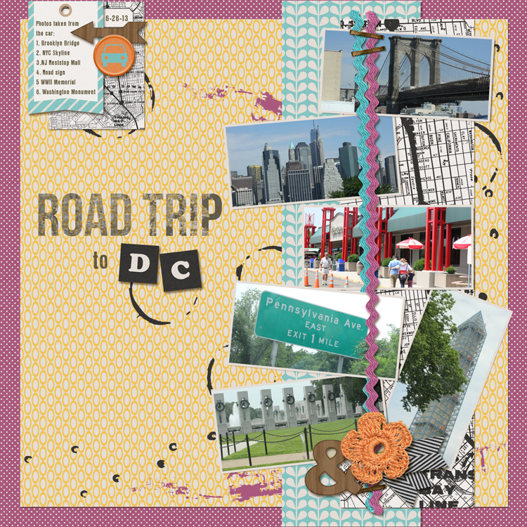
    The name of the kit for this layout is Day Tripper.  I thought this might be a great way to use some of the photos I took from the car on the trip to Washington DC.  The photos are less than stellar due to fast moving.  I took the picture at the rest stop in New Jersey because I was blown away by how fabulous it was; not at all like the rest stops here in Washington state.  I had wanted a road sign that told how many miles to Washington DC but they whizzed by much too fast for me to get a shot.

 
Day Tripper by Dawn by Design (Pixels & Co.)
Font: LL Rubber Grotesque

Thursday, July 18, 2013

P&C CT Layout #10

     Did another layout for Pixels & Co.  This time I used more of an older kit, Menagerie.  I used for the first time some stamps from Karla Dudley.  I had to recolor the paper and some of the embellishments to match Rachel's necklace.  The layout has a very serene, yet warm feel to it because of the colors.  I lightened the photos because there was heavy shadows since they were taken indoors on a very sunny day.  Overall, I'm loving it:

 
Skyscraper Templates by Shannon McNab (Pixels & Co.)
Menagerie by Celeste Knight (P&C)
Simple Sequins by Gennifer Bursett (P&C)
Scrolling Brushes by Wild Blueberry Ink (P&C)
Stamp Press_Photo by Karla Dudley
Fonts: Pacifico, Playtime with Hot Toddies

Art Journal Challenge for July at Jessica Sprague.com

     The AJ challenge this month at JS.com is to use circles.  I noticed that most of my layouts so far have had hearts in them, so this would be a good change.  I came across a new layout by Lynne Marie and saw the circles and immediately knew I could use it for this layout.  The weirdness of the layout also was attractive to me.
     Brian and I were out in the dark trying to do light painting for my Night Photography class at JS.com and I thought about the darkness of this kit, it made a good fit.  I wanted to use my eyes in some way, but I wear glasses and I didn't want my glasses to be in the layout.  So I played around with the selection tool and extracted one eye.  I didn't have a firm idea of where to place the eyes.... then I stuck them on the flowers -- weird! or maybe gross? -- definitely weird.  I came up with the title after that.  It goes with the eyeball flowers and the night photography all mushed together.... guess that's what art journaling is all about.

 
Land of Odds by Lynne Marie
Tea Stains by Wild Blueberry Ink
Fonts: Graphers Blog; Dancing Script; Diesel; Bitty by Audacious Design