Tuesday, July 30, 2013

My Turn

     This is definitely my last layout for the CT commitment.  I'm going to say my thank you and good-bye on the forum tomorrow.  It has been an interesting month.  Being a CT is hard work and not a commitment to take lightly.  By being invited to join the team as a guest this month was great because I had access to a LOT of new releases.  I even got some older kits that I've wanted.  I got lots of templates which I didn't think I'd want but turns out I did.

 
I Heart Templates set two by Tiffany Tillman (Pixels & Co)
Organic Green by Mindy Terasawa (P&C)
Hello by Creashens (P&C)
Scarlet Letter by Gennifer Bursett (P&C)

Daytripper by Dawn by Design (P&C)
Font: Just the Way You Are

Photo Fun Redo

     I did make a couple of photo switches; I like it much better because it goes with the journaling better.

 
I HearTemplates by Tiffany Tillman (Pixels & Co)
Scarlet Letter by Gennifer Bursett & Mommyish (P&C)
Fonts: Janda Elegant Handwriting, Traveling Typewriter

Photo Fun

     The layout colors don't look Christmasy, but these pictures were taken Christmas Eve 2012.  I don't think I picked the best photos of the bunch since Brian's expression in all of these is about the same.  There were others I shot that showed more variation.  Maybe I should do a redo. 
 

I HearTemplates by Tiffany Tillman (Pixels & Co)
Scarlet Letter by Gennifer Bursett & Mommyish (P&C)
Fonts: Janda Elegant Handwriting, Traveling Typewriter

Monday, July 29, 2013

P&C CT Layout # 22

     I used a new kit named Dude for this layout, so it was a natural to use photos of Ewan.  I find that if I use a template the layouts go faster and I need to get these done before July 31 which is my last day to guest CT. 
     I certainly have gotten a lot of photos scrapped this month.  Overall, I'm very pleased with my work.
 
Layered Looks template by Tiffany Tillman
Dude by Robyn Meierotto
Font: Bebas, Playtime With Hot Toddies


Saturday, July 27, 2013

The Big 5

     I noticed looking back at the layouts on the blog that I am kind of light on layouts for Ewan.  I realize that my most recent photos are of Vivian and her family, but I have lots of Ewan, too, that I can scrap.  I did one layout already about his birthday, but I have more photos that I want to scrap, so here goes....
 
A Piece of Me template by Elizabeth Albers
Hootenanny & Flying High by Dani Mogstad
Dear Diary by Agnes Biro
Freebie tape by Flergs
Fonts:  MTF You Are, MTF Big Ideas, Pacifico


I guess there was one more....

     I guess there was one more layout in me.  I really liked a flower in the Golden Pears kit so I downloaded it.  It is about pairs so the first layout I did was with a photo of Alexis and a photo of Vivian.  The two photos were from different days and the coloring was just not complimentary between the two.  I finished the layout at 11:30 pm but decided to sleep on it.  This morning I looked it over and it was okay, but...
     I decided to start over afresh to see if this morning would yield a better layout.  I decided this time to start with the photos and then to pick the elements from the kit.  Both times I used the same template. 
     I have not done any layouts with Chris that I can remember, so I picked a photo of Rachel and one of Chris -- there's my pair. 
     From there I picked the elements.  I added a few things that were not in the template, but I stuck exclusively with the Golden Pears kit.  Unfortunately, I went with the dark background paper again because it was a feature of the template.  I just didn't like the lighter papers anyway.  I think it turned out nicely.

Playful template by Mye De Leon (Pixels & Co)
Golden Pears by Dawn by Design (P&C)
Font: Bebas

Friday, July 26, 2013

Maybe my last CT layout....

     This is maybe my last CT layout for P&C.  I have used every kit I've downloaded and I don't think I'll download anymore unless I'm totally in love with something.  I need to move on with other aspects of my life.  I've enjoyed the CT experience, but it was pretty time consuming.  I'm not sure I did a good job since there has been NO FEEDBACK from the website.  I did get a lot of free stuff, but most of it I probably wouldn't have purchased if I had needed to use MY own money.
     Since one of the last kits was stamps with a school theme so I needed to use a school photo.  I didn't want to use one of my former students, so I decided to use a photo of Ewan at my classroom and there won't very many of those.
     The color theme was set by the other kit I needed to use.  They are not my favorite colors by any means but that is the life of a CT isn't it -- making pages with things they don't necessarily love.

All supplies by Karla Dudley:
Stamp Press_Schooled
Mellow Yellow
Storyboards 1 template
Fonts:  What a Teacher Wants, Ariel

Improved layout....

     For a long time I have felt like my July P&C Challenge layout was lacking something.  I literally followed the layout directives, but I didn't add anything more to the layout which gave it a minimal feeling down the middle strip.  I found another layout in the Challenge gallery that reminded me a lot of my own layout, but it had additional items which gave it a clustered feel. 
     I scraplifted some of the ideas from that layout to add more detail to my own.  I also changed the center stripe's dimensions which helped tremendously.  I like it much better.  See what you think....
 
First layout:
 
 
Dawn by Design: Simply Put template 4; Skyline, Sun and Fun
Karen Funk: Daydream
Karla Dudley: Nillie; Life 365
Robyn Meierotto: Frill
Shannon McNab: Make a Date
Creashens: Hello
Fonts: Appleberry, KG Cold Coffee, Impact, Parisienne, Bebas, JuneBug, Lobster1.3, Cafe Rojo, Pharmacy, MTF Big Ideas

Revamped layout:


Additional supplies:
Bluebird on My Shoulder by Chelle's Creations
Cornered 01 by Creashens
County Fair and Chaising Rainbows by Dani Mogstad
Falling in Love by Bella Gypsy
Summer Flair by Mommyish
Room Collection by Crystal Wilkerson 
 
     Seeing the two side by side just now, I realize that the two layouts are pretty good in their own right.  The second one is just busier looking.  I guess it comes down to a matter of taste.  Right now in the galleries, the busier design is more favored, but I actually like the focus on the photos of the first design -- oh, well....


Thursday, July 25, 2013

This layout is for me.

    I have been craving time and energy to do a layout using more artsy detail.  I used Anna Aspnes' ArtsyKardz as the basis of it because she puts layers and layers of paint, texture and overlays into her psd files.  I picked out the photos immediately but had trouble with how to show the second lower photo.  At first I worked at doing it as a blended area, but after looking over some of the galleries, decided to frame it with some minimal embellishments. 
     When I searched for some word art for the title I decided to use a new P&C file I just got recently and I think the two words are just the right touch.  The expression in the framed photo tells the story so I didn't do any journaling other than the date. 
     The colors in the Artsy template went perfectly with the photos.  The flowers in the lower right hand corner are actually from some paper that I clipped to a paint layer.  They are really cool, I think.

 
ArtsyKardz Truth & ArtPlay Inflorescence by Anna Aspnes
Chalkboard Elements by Celeste Knight
Card Fusion by Aria Designs
Tell Your Story by Joie de Vivre
Potential by Dawn by Design
Ordinary Moments & Wildflowers by Anita Designs
Word Art_Random Words by Robin Meierotto
Font: Catflisch Script Pro

Monday, July 22, 2013

CT Layout # 19

     This is a much brighter and cheerier layout.  I wanted to use the black photo word art and it calls for a much cleaner layout.  I needed a bunch of photos from one day.  This series doesn't show the whole day but it does show one of our treks to the library.  We stopped off at the dollar store on the way.  I had to recolor one of the torn papers at the top to make it match the other black elements.  I added the red to the little hearts.

 
Stamp Press_Photo by Karla Dudley (Pixels & Co)
Torn & Stitched, Easy Livin (paper) by Mye De Leon (P&C)
Wide Washi Tape by Karen Funk (P&C)
Font: Jenna Sue
 

CT # 18

     The main focus of this layout is actually the swirly stitches.  I also wanted to use the Easy Livin kit a little more but it didn't have a good frame, so I used one from Currently.  The butterfly was a nice touch for the stitches, I thought.  To make the stitching really standout I needed a dark paper, so that makes two dark layouts in a row.  I think the white frame is a little too overexposed but I didn't have an alternate one to use so I just went with it.

 
Easy Livin, Currently (frame), Spread Your Wings (butterfly) by Mye De Leon (Pixels & Co)
Swirly Stitches by Shannon McNab (P&C)
Fonts: Legion Slab, Janda Elegant Handwriting, Fontleroy Brown

Sunday, July 21, 2013

# 17

     I finally got to scrapping the chalkboard kits that I downloaded a few days ago.  The clip art gave me the idea of which photo to pick.  I do love this photo of Vivian.  The dress, leggings and sunglasses are to "die for".  It's kind of a dark layout, but that's the nature of chalkboard paper, etc.


Chalkboard Elements & Chalkboard Tags by Celeste Knight (Pixel & Co)
Daytripper (paper) by Dawn by Design (P&C)
Page Blenders by Mye De Leon (P&C)


Saturday, July 20, 2013

Cutie Pie is # 16

     I'm on a roll tonight so I followed the template very closely.  I changed out a doily for the three flower stamps.  I used one kit for the whole layout.

 
Paper Strips template by The Ardent Sparrow (Pixels & Co)
Familiarity by Karla Dudley (P&C)
Font: The Dawn
  

Layout # 15

     I finally made a layout that features Greg.  It, of course, includes Vivian.  The template that I used features lots of layering which is something I'm not particularly good at.  The kit had lots of elements to use for the layering, but not a good set of leaves.  I had to get the leaves from another kit.  I kept everything from the same designer.

 
Layer It Vol. 3 template by Mye De Leon (Pixels & Co)
Currently & Let It Be Me by Mye De Leon
Fonts: Precious, Bebas, Century Gothic

Friday, July 19, 2013

P&C Layout #14

     I felt bad that I had to abandon that layout with Ewan.  I found some elements to a kit I got for $1 from the old Design House Digital site.  The designer got married and now designs under her married name; I had her maiden name listed in my database and didn't realize that Shannon McNab used to be Shannon Haggerty.  While I can still get freebies, I nabbed the elements to round out the kit.  Even though the photos were taken in the spring, it has a fall feeling to it. 

 
Clear Plates Vol. 1 template by Karla Dudley (Pixels & Co)
Newsprint by Shannon McNab (P&C)
Watercolor Splatter by Celeste Knight (P&C)
Font: Ask My Flashlight
 

# 13

    I downloaded another template and kit from Karla Dudley today.  I made the layout with a great picture of Ewan.  The coloring of his hair and clothes matched the papers perfectly.  When it was completely finished I realized the layout was FULL of flowers (not very masculine).  I substituted a photo of Alexis and Vivian, but Vivi's dress was bright blue and white which just didn't go with the papers.  I took the color out of the photo and did an adjustment with the hue and saturation sliders.  It's not quite as perfect, but cute nonetheless

.

Clear Plates Vol.1 template by Karla Dudley (Pixels & Co)
Right Now by Karla Dudley
Font: Ask My Flashlight

P & C # 12

    The name of the kit for this layout is Day Tripper.  I thought this might be a great way to use some of the photos I took from the car on the trip to Washington DC.  The photos are less than stellar due to fast moving.  I took the picture at the rest stop in New Jersey because I was blown away by how fabulous it was; not at all like the rest stops here in Washington state.  I had wanted a road sign that told how many miles to Washington DC but they whizzed by much too fast for me to get a shot.

 
Day Tripper by Dawn by Design (Pixels & Co.)
Font: LL Rubber Grotesque

Thursday, July 18, 2013

P&C CT Layout #10

     Did another layout for Pixels & Co.  This time I used more of an older kit, Menagerie.  I used for the first time some stamps from Karla Dudley.  I had to recolor the paper and some of the embellishments to match Rachel's necklace.  The layout has a very serene, yet warm feel to it because of the colors.  I lightened the photos because there was heavy shadows since they were taken indoors on a very sunny day.  Overall, I'm loving it:

 
Skyscraper Templates by Shannon McNab (Pixels & Co.)
Menagerie by Celeste Knight (P&C)
Simple Sequins by Gennifer Bursett (P&C)
Scrolling Brushes by Wild Blueberry Ink (P&C)
Stamp Press_Photo by Karla Dudley
Fonts: Pacifico, Playtime with Hot Toddies

Art Journal Challenge for July at Jessica Sprague.com

     The AJ challenge this month at JS.com is to use circles.  I noticed that most of my layouts so far have had hearts in them, so this would be a good change.  I came across a new layout by Lynne Marie and saw the circles and immediately knew I could use it for this layout.  The weirdness of the layout also was attractive to me.
     Brian and I were out in the dark trying to do light painting for my Night Photography class at JS.com and I thought about the darkness of this kit, it made a good fit.  I wanted to use my eyes in some way, but I wear glasses and I didn't want my glasses to be in the layout.  So I played around with the selection tool and extracted one eye.  I didn't have a firm idea of where to place the eyes.... then I stuck them on the flowers -- weird! or maybe gross? -- definitely weird.  I came up with the title after that.  It goes with the eyeball flowers and the night photography all mushed together.... guess that's what art journaling is all about.

 
Land of Odds by Lynne Marie
Tea Stains by Wild Blueberry Ink
Fonts: Graphers Blog; Dancing Script; Diesel; Bitty by Audacious Design
 

Monday, July 15, 2013

Birthday Fun -- Layout # 10

     I used four more kits for this layout.  I used a couple of things that I've only used a little bit of to justify getting the kits free.  I have been cranking out layouts faster than ever before.  I'm not able to be as creative as I would like because I have to use 100% P&C product and that site doesn't have everything I would like to use.  I also feel kind of funny buying older kits since they'd really want the newer releases featured (this wasn't actually said but it's what the other CT's do).  I used Ewan's birthday pictures for this layout.

 
Birthday Fun
Fun with Shapes template by Crystal Livesay (Pixels & Co.)
Mellow Yellow by Karla Dudley (P&C)
Throwback & Page Blenders by Mye De Leon (P&C)
Alpha Cards by Geniffer Bursett (P&C)
Whimsey font by Audacious Design (P&C) & Chunk Five

Sunday, July 14, 2013

#9

     As soon as I saw the preview for Mye's kit, Spread Your Wings, this layout came into my head.  I had just taken a photo of a butterfly at Ewan's birthday party and I knew it would be a natural.  The hexagons were scraplifted from Katherine Hansen's layout (which was totally different from mine) but I didn't use a template like she did.  In fact, I ventured into a tool I have not previously used to draw my hexagons-- seemed to work.  I have a LOT of various shadows on the butterflies to give them depth.  I used an inner drop shadow to give the hexagons a cut out look.  It's not as realistic in PSE as in full PS, but it turned out fairly well.

 
This layout was inspired by Mye's preview for Spread Your Wings.
Spread Your Wings & Easy Livin by Mye De Leon (Pixels & Co.)
Menagerie by Celeste Knight (P&C)
Skinny Stitches by Shannon McNab (P&C)
Bitty font by Audacious Design (P&C)

#8 for P&C CT Month

     I bought this kit today and the font.  I made the mistake of uploading the font into an ACDSee folder and now I can't get it off, even though I moved it to a different folder and there nothing there anymore.  Sometimes ACDSee bugs me.
     I had trouble getting this layout going.  The black and white paper is pretty strong and I knew the colors would pop on it.  I wanted to use lots of the black and white designs, but it was just too busy and I lost the drama of the colors, so I scrapped (old meaning) the first layout and tried again for a simpler version.  It's pretty simplistic, but at this point I just want to get the layouts done as I've downloaded a whole lot of additional stuff.  I added the pink colored chevrons with the paint bucket tool; I really like the attention it brings to the photo.
     I found a layout by Katherine Hansen that I ABSOLUTELY love and I got some of the kits she used to reproduce (scraplift) it for myself.  So I'll have to use that kit in a different way first for the CT requirement.  Here's the new layout:

 
Juicy kit & Whimsey font by Audacious Design

Saturday, July 13, 2013

P&C Layout #7

     I got another layout done for P&C.  I went for a lot of white space for this one.  The pink color in the kit and the muffins reminded me of the cupcakes at Georgetown Cupcakes which use the pink color to the nth degree.  I only used one photo to keep the white space theme going.
 
 
NuffinMuffin by Creashens
Tea Stains by Wild Blueberry Ink
Watercolor Splatters by Celeste Knight
Font:  JustColesCursive

Friday, July 12, 2013

P&C Layout #6

     I got another layout under my belt.  I've been wanting to blow up the swirly dress photo of Vivian twirling the hoola hoop ever since I saw the photo.  I used part of a template that featured a torn paper.  The template revealed a hidden torn paper that had big pink flowers.  I really like it and decided to keep it.  It's kind of bold compared to the muted photo.

 
February Pixels & Co. challenge template, paper & frames
Scrolling Brushes by Wild Blueberry Ink
She Creates by Dawn by Design
Cornered 1 by Creashens
Simple Sequins by Gennifer Bursett
Stamp Press Life by Karla Dudley
Font: Traveling Typewriter


P&C Layout #5

     I downloaded a boatload of kits from P&C and I have to get them into layouts before the end of the month.  This is my latest:

 
Skyscraper template 2 by Scotty Girl Design
Wide Washi Tape-White by Karen Funk
Easy Livin & Throwback by Mye De Leon
Alpha Cards by Gennifer Bursett
Fonts:  KG What the Teacher Wants, Lobster 1.3

Cropped!

     I got the bad, but not surprising, news that I have been cropped!  They reduced the field of 90 to 32.  I'm not all that disappointed.

Thursday, July 11, 2013

Cropped Round 1 contest

     I entered the P&C Cropped contest.  After looking at the other entries, I realize mine is pretty simplistic and plain.  It met all the criteria but I don't think I stretched myself artistically.  I didn't think I would be the final winner but I thought I would at least get out of round 1.  We'll see what happens....
 
Cropped items: Chevron paper (reduced opacity) by Robyn Meierotto, Everyday stamp by Mye De Leon, Rainbow (recolored) by Karen Funk, Overlay (recolored) by Dawn by Design;
Sunkissed, papers and elements by Dawn by Design (P&C)
Hello alpha by Creashens (P&C)
Font: KB What the Teacher Wants

Friday, July 5, 2013

4th post for Pixels & Co.

     I completed my 4th CT layout for Pixels and Co. which is my obligation.  I believe I have used something from every kit I downloaded with the exception of some sequins that I didn't actually request, but were a "free with order" item.  I have to admit that it feels good to know I've fulfilled the requirement.
     I think I need to put the computer away for a while because I've had my nose in it pretty constantly and I need to focus on my precious family.  I will be leaving soon and I want to enjoy real time with Vivian, Lexie and Greg.
     The photo was taken by Alexis.  I used the lessons from "Good to Great" at JS.com to enhance the photo which was fairly dark with lots of shadow.  I think it is about the only picture of me on this trip.  I need to get into more of them.  Here is the layout:

 
Paper Strip template by Ardent Sparrow
She Creates by Dawn by Design (Pixels&Co.)
You Are My Sunshine; Torn and Stitch (P&C)
Fonts:  MTF Pork Chop, MTF Big Ideas

3rd Guest CT Layout

     I finished my 3rd layout for Pixels & Company.  The Americana kit seemed the perfect fit for the Jefferson Memorial.  I used the healing brush tool to take out some people in one of the photos and a dark circle over the statute's head in another.  I used some of the techniques I just learned in Jessica Sprague's "Good to Great" photo editing class to lighten the midtones in the photo with the full size of Jefferson.
 
Americana by Dawn by Design and Mommyish
Fonts: Jefferson, Typography Time

Thursday, July 4, 2013

July Challenge at P&C

     I completed another monthly challenge.  I went for the CEO level again.  It was really tough since it had a journaling section and a subway art section.  I tried to use as much P&C supplies as possible.  I think I'm the only person (as far as I can tell) that has done the CEO challenge 3 months in a row.
     For the subway art I tried to use some designers word art as well as fonts.  I think it added an element of fun.  I slept on the layout and during the night decided to do the journaling as a description of the photos rather than a general information about me and the trip. 


 Dawn by Design: Simply Put template 4 Skyline, stamp, WA; Sun and Fun, sticker
Karen Funk: Daydream, paper
Karla Dudley: Nillie, WA; Life 365, camera
Robyn Meierotto: Frill, paper
Shannon McNab: Make a Date, heart
Creashens: Hello, flair
Fonts: KG Cold Coffee, Appleberry, Impact, Parisienne, Bebas, June Bug, Lobster 1.3, Caffe Rojo, Pharmacy, MTF Big Ideas

P & C CT Layout #2

     I finally was able to post my two layouts that are part of my CT duties at Pixels and Company.  I am pleased with how they look.  I was able to download two new kits today and have started on layout #3.  Since I'm a guest CT, I want to make the layouts just right so it's taking a long time.  Here is #2.

 
Liberty template 1 by Crystal Livesay
Fit to Print, paper; Destination kit by audacious Designs
Mark a Date by Shannon McNab
Fonts: Janda Curlygirl Chunky, KG What Teacher Wants

Tuesday, July 2, 2013

Jessica Sprague July Challenge

     The scrapbook challenge this month called for a panoramic photo with a white title across the image.  I thought about a New York skyline, but when I saw the darkness and somberness of the Vietnam memorial statue, I just knew it was the photo to use.  It is so simple in design which makes it all the more appropriate.  This is a tribute to Brian and all those who served.


July challenge template by LivEdesigns
My Life at Play by K. The Scrapbook Lady, paper
Chasing Rainbows by Dani Mogstad, paper
Fonts:  Janda Elegant Handwriting, Bebas

Guest Creative Team layout for Pixels & Company

     I downloaded some free items from P&C for my guest CT layouts, worked for HOURS on the first LO, tried to upload it and P&C hasn't recognized me as a CT yet so it FAILED.  I'm somewhat discouraged that this is not going very smoothly.  I know the site is working on a new contest and they are super busy, but they INVITED me to join...I wish they would activate it or else not invite people.
     Besides being nervous about the whole CT thing, I feel a huge responsibility to use the free products in the LO's and doing a GREAT job for the designers while still trying to make things I like and reflect ME.
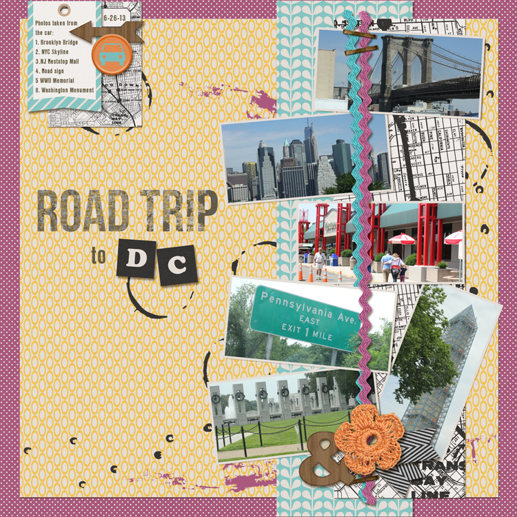
    I had to make selections around all the frames because WBI put all the frames on one layer.  I wanted to delete some of them and move others around to make the LO my own.  The next challenge was the title; I had to move and delete frames to get the placement just right.   Here's my first layout:

 
100% Pixels & Company
Seed No. 3 template by Wild Blueberry Ink
Scrolling Brush by Wild Blueberry Ink
Make a Date by Shannon McNab, heart
Liberty Paint by Crystal Livesay
Ombre 1by Mommyish, papers
Fonts:  MA Sexy, Legion Slab